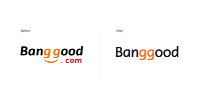
GUANGZHOU, China, Dec. 26, 2019 /PRNewswire/ -- Banggood, a leading Chinese online retailer that focuses on cross-border export e-Commerce, has unveiled an update to their logo and brand positioning ahead of 2020. Banggood's new branding has already been updated across its website, as well as its mobile terminals, ensuring the brand is ready to welcome in the new decade with a brand-new look.

Banggood, a leading Chinese online retailer that focuses on cross-border export e-Commerce, has unveiled an update to their logo and brand positioning of transforming from an e-Commerce platform to a user-centered initiator of colorful, diversified ideal lifestyles.
Banggood's new logo draws on elements from the previous logo and reimagines them to represent the brand's new positioning and strategy better. Banggood has adjusted the typeface and reduced the font-weight and slant for a modern and slick aesthetic; while increasing the brightness and shade of the iconic orange color to be more vivid and eye-catching. In addition, the smile graphic has been removed from the brand logo and will instead be used on supporting graphics. Finally, Banggood's new color palette combines the orange — conveying its youthful and energetic spirit — with dark blue and black, which symbolizes its unwavering professionalism.
"Our new logo better captures the elements of youth, modernity, ease and diversity — all of which form Banggood's new brand strategy and direction," said Aaron Chen, Operations Director of Banggood. "The logo update is the first step in our journey to transform Banggood from an e-Commerce platform to a user-centered initiator of colorful, diversified ideal lifestyles."
Over the past 13 years, Banggood has demonstrated its potential as a promising global e-Commerce leader and has ranked in BrandZ's Top 50 Chinese Global Brand Builders for three consecutive years. Committed to bringing China's high-quality goods, efficient supply chain and top class customer service to the world, this August, Banggood announced an update to its corporate slogan from "Best Bucks for Your Bang" to "Good Life Doesn't Cost a Fortune", in line with its new self-positioning and development goals of "creating a better quality of life for users".
To help users achieve a better quality of life, Banggood has made significant updates to its website to enhance the user e-Commerce journey for 2020 and beyond. The layout adopts a flat framework to reduce complex user interactions and harnesses white space and color blocks to distinguish information hierarchy better. The typography and page speeds have also been optimized to increase browsing efficiency.
Furthermore, Banggood has overhauled the front end of its website to improve web design in line with current trends. The site features the new brand logo and slogan, as well as the brand color, while eliminating other colors to provide a cleaner and simpler interface. At the same time, Banggood has reduced the design and content within its website blocks for a softer and more refined browsing experience.
About Banggood
Founded in 2006 and headquartered in Guangzhou, China, Banggood is a leading e-commerce company in China. By running its website www.banggood.com and pages on other platforms, Banggood has sold more than 500,000 types of products to the United States, Britain, Germany, France, Spain, Australia, Russia, Japan and other countries.
For more information, please visit: https://www.banggood.com/aboutBanggood.html
Media Contact
Louis
+86-131-6877-4044
pr@Banggood.com
![]() View original content to download multimedia:http://www.prnewswire.com/news-releases/banggood-unveils-new-logo-and-branding-for-2020-300979321.html
View original content to download multimedia:http://www.prnewswire.com/news-releases/banggood-unveils-new-logo-and-branding-for-2020-300979321.html